Textual Analysis of Double Page Spreads
Kerrang Magazine

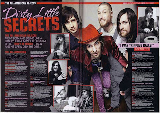
- The colour scheme used on the double age spread coincides with the colours of the clothing that the lead singer of the band is wearing. This makes the text easier to read and the colours used don't contrast each other.
- There is slightly more text than there is images however, at first glance it looks equal so the reader isn't overwhelmed by text.
- The text is in columns and is very orderly so it also makes it easier to read. The colours used on the text indicate when a question is being asked, who is answering, etc. This makes it structured and easy for the reader to find what they're looking for.
- The smaller black and white images around the main image give you a better perspective of who they are individually rather than as a group. There is a red outline around each of the smaller images to define each one so they don't 'blend' in together.
- The pull quote of "I was tripping balls!" suggests something that they shouldn't being doing which implies more secrets are hidden within the text. This makes you want to reader the interview more to find out why they were "tripping balls!".
ATM

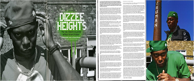
- The first of the double page spreads is a poster-like image of Dizzee Rascal maintaining his 'bad boy' image and, suggesting that he hasn't let the fame influence him as the location he is in isn't glamorous. They are street locations which have a direct link to the nature of Dizzee's Hip Hop genre.
- Within the four pages used for this article, 3 of them are dominated by images. However, there is a lot of text on the one page that is does dominate. It is written in conventional paragraphs which generally take up less space which means there can be more of them.
- The text is in two neat and tidy columns which follow the style of the magazine and, suggests that it is a serious, easy-to-read article. The audience of the magazine may be into the music so, they have focused on the music rather than making the page look pretty.
- The main headline ‘Dizzee Heights’ also uses a pull quote "for me there's no grime with drum and bass". By using 'Dizzee Heights' as a title they are introducing the artist but, they are also suggesting that he has come so far in the music industry and rose so high that he doesn't actually realise the influence that he has on some people.
- They have made the image black and white to highlight the green headline and to make the image look more serious so it supports his 'bad boy' image.
- The green colour scheme then continues on to the other double page spread on his t-shirt and hat. As they have only used a colour scheme of black, white and green it suggests that this is a feature colour for him.
MixMag
- The editors on this double page spread have used the colour scheme of pink, yellow and black. They have used these colours to convey a party atmosphere as they are vibrant and, they have used the black so they stand out even more. This will encourage the readers to read this article as MixMag is a dance magazine.
- Each section is clear as they all have sub-headings which make it easier for the reader to fins the section they want to read.
- The images do not dominate the page as there is a roughly equal image to text ratio. Also, i think the images are suitable as they support the stories on the page.
- The images also help the readers to relate to the stories as they give you a feeling of the atmosphere int heir location. The audience are also going to be party goers so it will help them to decide whether they think it looks fun or not.


No comments:
Post a Comment